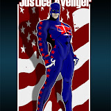
I'm considering changing the template (again ... this is Time Number 8 Bazillion) because I think the current one is just too boring and I don't think it really represents all the different things I put on this blog. In a startling change of policy and good sense, however, I have tried out the new changes on a test platform before just springing it on you.
So for anyone who's willing, please take a look at the test site and let me know what you think of that proposed look versus the current one. Or any of the 8 bazillion previous ones for that matter.
Thanks for any feedback you're willing to provide!
Saturday, April 07, 2007
METAPOST: Yet More Changes
-
4/07/2007 01:12:00 PM
Subscribe to:
Post Comments (Atom)


6 comments:
In the banner, "Nerds" should be "Nerd's" with an apostrophe. ...unless there are more than one of you, in which case there are additional problems with the phrase as printed. :-)
Ok, but remember YOU asked for it. I still like the very first HOBBIT - the colors, content and shape were easy to read and easy to open with pictures. This one is, well, this one is, well, sorta not dull, sorta bright like really vivid and slow to open from dial-up - I know, I know, you're tired of that refrain. When the covered wagon train gets to this end of Burnet County, we will have wireless.
Love it. Very styling. I particularly love the Jeff cartoon with the Mage shirt and the pitchfork. I also love the little images, as well as the font treatment of the name.
I'd only recommend a few very minor changes:
* As Allen pointed out, you need an apostrophe. Also, "100-Acre" should be hyphenated.
* I think you might want to nudge the logo down so that it's not quite so much on top of the "Ramblings of" line.
* The orange on the right side looks maybe just a tad too bright. Particularly as you scroll down through a bunch of posts, it might be a bit much.
* The nonlinked text on the orange block (grayish bluish green?) is kind of yuck. The colors just don't seem to complement each other.
* Like I said, I love the little images. But mostly because I am familiar with many of them and know what they are. If I didn't, I think they'd be so small I couldn't make them out. I think I would maybe double their size and make them into two rows instead. You're a very talented artist. Show that off.
Thanks for the feedback everyone, I appreciate it. And while I grow ever fatter, I don't think I am quite plural yet, so thanks for catching that, Allen and Rob.
Sharon, I feel your pain. Annie likes the Hobbit template best of all, too. But it just wasn't "me". Partly it's that (like Rob said earlier) I'm not as much of a Tolkien nerd as I am a super-hero nerd, so that didn't quite fit. And I felt like there was an awful lot of wasted space in that header area, along with the kind of grandma-ish background tile. In general, I thought it was just too ... I dunno, depressing or boring. It just didn't fit.
I still don't think I've nailed it completely with this version but I think it's as close as I'm going to get. Trying to tie in super-heroes, animals, country living, and random fun humor themes is a challenge, I've discovered. I think this layout gives off more of a fun feeling that captures "me" a little better.
Rob, your points are well taken. I've lightened the orange quite a bit and made some other text changes that I think help readability. I've left the small strip of images there, because fitting in two rows was making it just too busy. I do have two sets of links in the right nav bar for more illustrations, and more photos as well, so anyone so inclined can easily get their fill of that kind of thing.
Anyway, hopefully this will be the last big change for a while. I'll be tweaking around the edges, but I finally feel like I have a template that's unique, fun, and fitting. I was tired of seeing virtually the same layout on every blog I read, so at least now I stand out a bit.
Thanks everyone for the ideas and suggestions, feel free to lay 'em on me any time!
Everytime I come to visit I think I've hit the wrong blog! It's never the same as the last.
I think this is a better fit than the hobbit themes even though I liked them. Don't seem to have extrodinary difficulty with my backwoods dialup - at least not anything unexpected.
Wasn't there one version where the pictures in the panel could be clicked to enlarge? That would be nice especially if you plan on changing them from time to time.
For the record, Rob is right that the caricature of me is basically a super-hero element (a shirt like that of Mage, an alternative comics character) and a country element (the pitchfork), representing the two alternating themes of this blog.
A subtler angle comes from the fact that I'm holding a pitchfork while wearing a red hat, clearly indicating I am in some way Satan, which I think is only fair since as an atheist I'm going to Hell anyway. The forked tail got cropped out, apparently :-)
Post a Comment