I've posted previously about how I create the illustrations I do for gaming magazines. I came across another good example of how much composition can affect the success of a drawing and though I'd share it with you here.
This assignment was for the book "Fantasy Hero Grimoire" for Hero Games. Ultimately this particular drawing didn't make it into print, which isn't all that uncommon. Layouts change from the time art assignments are given out to when the final product is put to print and you have to lose some things.
The commission was to create an illustration of a pary in a dungeon finding a secret door via magic spell. I had in mind a blindfolded magic-user surrounded by his party. I thought having him float would be a good way to show that he was using magic, in addition to whatever spell effects I could come up with. Here was the first pass: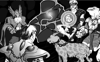
I liked the mixed races of the party members, especially the dwarf. I'd drawn him previously for a game I was playing, and was able to just cut and paste him in. The idea behind this treatment was that the mage was casting a spell showing where the door -- disguised as a part of the dungeon wall -- was hidden, and then a tendril of magic was touching and highlighting the door. It didn't work. It looked like two groups of guys about to fight while some blindfolded whacko was holding up a map of Wisconsin. The feline pet creature in particular looked menacning and out of place. Back to the drawing tablet.
I tried eliminating the bothersome pet and bringing in a new creature to the foreground to give the composition some balance. Better, but the other problems still remained: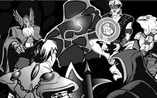
I thought that the new character's axe was too threatening to the poor elf, so I tried swapping them. Because each character is on its own layer in Flash, I was able to do this without having to redraw the entire piece like I would if it were on paper.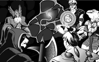
That layout was better, but I finally decided the entire mage-door part was just too confusing and unclear. So I deleted that whole set of layers and drew a new, more active, unblindfolded mage standing there casting a spell at a more regular looking door.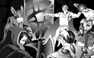
This was closer, but the more I studied it the more I felt it still didn't look like a party of guys who were all on the same team. So I rearranged them all, resizing where necessary (and remember, in Flash I didn't lose any line quality by expanding a figure), and finally ended up with this: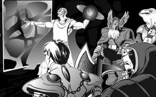
With all of the figures facing the same direction, they felt much more like a team. It also focused attention on what the mage figure was doing, which was the whole point of the illustration in the first place.
Looking back on it now, years later, there are still some things I'd do differently. I think I needed a definite floor and walls instead of the black background -- it's not easy to tell they're in a dungeon. And the door still doesn't really look like a hidden door, it could be a wall or mirror or force field or who the hell knows what. Still, it's much better than it started out being, and for that I am happy.
Wednesday, February 22, 2006
Illustration Layout II
-
2/22/2006 07:07:00 AM
Labels: super-heroes, tech
Subscribe to:
Post Comments (Atom)



2 comments:
I miss the Roomba and all associated comments.
Jeff, i always thought Jimmy would grow up to design comic books and action heros! i'm glad you are living your dream! the story about Jimmy making the superman figure for you really touched me. thanks for the opportunity to get to know who you are!
Post a Comment