Ever since I started drawing as a kid, people have looked at work I've done and asked "How did you do that?" I think most want me to answer "Magic!" because the true answer -- hard work and time -- is pretty boring. However, driven by the continuing inquiries and inspired by this post by a truly brilliant artist called "Olduvai George" (whose brushes I am not fit to rinse) about how he creates his masterpieces, I thought you might like to see how I went about creating a cover for a role playing game magazine.
Because this is a lengthy post with lots of large images, I've put it after a "Read More" link so those of you NOT interested don't have to sit through the download.The Project
The first thing you need is an idea. That can be intimidating if you're just goofing off, but usually if you're drawing for money the client has already supplied this for you. In this case my client, Hero Games, wanted a cover for the premier edition of their online magazine, "Digital Hero". Sometimes you get a lot of art direction ("I want a woman in a red dress with a matching Gucci bag who looks like Mariah Carey in front of the New York Deli on a sunny morning holding a white poodle ...") and sometimes, like here, you get something a little more vague ("Several heroes all together, something having to do with creating characters for the game.")
When I have that much liberty, I try to get a quick sample of my idea to the client for their approval before I go nuts and spend weeks creating something that they're ultimately going to reject because it wasn't at all what they had in mind. Because even when they tell you they don't have anything in mind, they do. So I quickly did this rough digital sketch: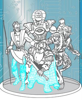 It's a good thing I did, because they hated it. "Too computery," was the main comment, and "It's a pen and paper game, not on the computer, character creation can't look like it's done digitally."
So, back to the drawing tablet.
I decided that grouping four characters together on a page of the game manual would be kind of neat. I could have representatives of the different genres of game the client's company produces -- realistic pulp fiction, four-color super-heroes, advanced science fiction, and fantasy -- and still reinforce the idea that this is a pen and paper game.
Once that was decided, I started drawing. I'll make another post at some point about all the steps you have to go through to get a final line drawing, but for now I'll skip all that. Suffice it to say that I ended up with my final four drawings, each one a complete figure on a separate layer. One of the nice things about Flash and PhotoShop is that you can have as many layers in your drawing as you want, kind of like they do for classic animated cartoons. Here are the four character layers I had: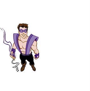
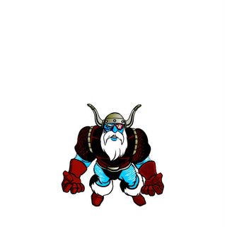
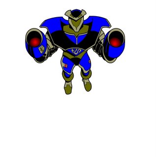
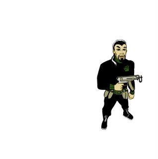
It's more time consuming to draw the full figure, especially since some of each will be hidden by one of the others. For instance, the robot figure ends up in the back of the group and you can't even see his legs. With the whole figure drawn, though, I am free to move them around however I want without having to worry about missing limbs preventing me from putting it where I want it. For instance, in this illustration the robot was originally in the front, but I thought he was better as a looming presence in the back. Because I had the whole figure, I was free to put him wherever I wanted him. And because it's in vector format, I was able to scale him down a bit, since he was now further away at the rear of the group.
Anyway, now I had my main grouping of characters, but I still needed a stage to put them on. I scanned a page of the rulebook, and saved the scan as a JPEG image. I brought that into Flash and put it on its own background layer, then distorted it so it looked like it was laying at an angle, flat on a table as seen from above, kind of "Star Wars" opening-credits style: After I studied it for a while, though, I decided that the shadow was too regular and it didn't really look like they were casting it. It looked like just a blob rather than a real shadow. Also I thought that the page in the background was too distracting -- there's another character illustration on the bottom right, and I felt it distracted from my far more glorious figures.
After a bit of thinking I decided to make a screen capture of one of the pages of a prototype edition of Digital Hero. That seemed more appropriate somehow. 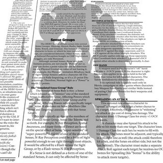 I also grouped together all the figures onto a new layer, combined them so they were all one big undifferentiated mass, filled the entire mass with black, and set its transparency to 20% so I could have a cool drop-shadow behind them.
The final step is subtle but I think really added to the final product. One of the key parts of the game the magazine is for features hexagonal grids that form the "Game board". So I created hexagons in Flash using lines, duplicated them into a whole page, then colored the lines white and set their transparency to 50% or so. I had to create a mask that exactly matched the silhouettes of the characters, like so: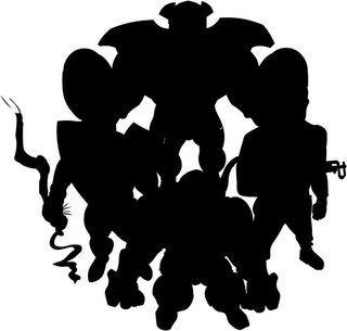 That way, the hexagons would appear only over the characters (everything black in the image above) and not over the page or background.
Finally all the pieces were ready. I put everything in its proper place and output the page at the size the client needed. Although Digital Hero was available online, you could also download and print it locally, so I had to output the image at a fairly high resolution. That wasn't a problem, thanks to creating the file in Flash.
So here's how the final version came out: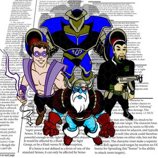 I was very pleased with how it looked. My technique creates a very four-color (that means classic comic-book style) look, whereas later on they wanted a more "painterly" feel for the covers. But it's still one of my favorite illustrations I've done.
I hope you found this interesting! If you'd like to see more samples of my freelance work, you can go to http://www.heromachine.com/portfolio.
If you'd like to see the original Flash file I used to create the illustration, you can click here to get it. Note that you will need the full version of Flash (i.e. lotsa money), not just the free Flash Player, to use it.Tools & Methods
I prefer to work completely digitally whenever possible. That means not only that I work with my fingers, but that all of the illustration work is done on the computer. I used to sketch out ideas in pencil, trace them with tracing paper, transfer the tracing to a nice piece of Bristol board, ink it by hand with a brush, scan the finished ink drawing, then color it in PhotoShop. Now I skip all of the preliminary stuff and do all of the sketching from beginning to end on the computer.
I use a small Wacom graphics tablet and do almost all of my drawing in Macromedia Flash. That's fairly unusual -- most digital artists use PhotoShop or Illustrator, reserving Flash strictly for animation. But Flash feels very organic to me, I feel like I am drawing on paper rather than drawing on a computer like I do with Illustrator. This method is best for black-line drawings like you see in newspapers or in comic books. It wouldn't be as good for more painterly projects that you want to look like, well, like painting. And of course the biggest advantage Flash has over PhotoShop is that everything is in vector format instead of bitmap. That means that your lines will all look exceptionally crisp no matter how you stretch or shrink them.
That's particularly important when you're working for money, because I can output my final drawing at any size and any resolution the client needs without having to do anything special. The same file can be used to print a giant billboard or just as a spot illustration on a web page. It gives great flexibility.
:: UPDATE :: Some of you HeroMachine users might recognize the Uzi the soldier character on the right is holding. It's a direct cut and paste from the HeroMachine "Ranged" genre of items held in the left hand. That's another reason I work in Flash for my freelance illustrations -- I can steal from myself. If there's an item I think would work well in a given drawing, I can cut and paste it, then customize as needed instead of having to come up with the entire thing from scratch.
Wednesday, February 15, 2006
Making an Illustration
-
2/15/2006 08:13:00 PM
Labels: super-heroes, tech
Subscribe to:
Post Comments (Atom)



8 comments:
Thanks Terry, I appreciate the comments. If people are interested I can do this sort of thing again. There's one illustration in particular for "Fantasy Hero" or one of its derivatives. I was supposed to show a mage of some sort using a spell to reveal a hidden door. I went through twenty different permutations before finally getting it right, and some figures had been swapped, flipped, stretched, and otherwise mangled to within an inch of their lives before I got them settled.
hey jeff, this is your cousin, mark. i am so happy to have this format to touch base with you! you seem very happy and i'm glad to hear how you are. it's a shame, on my side, that we have been out of touch all these years. i'm a sign artist and am just dragging myself into the computer world. i am learning the new adobe CS2,but have a long way to go! it's good to connect with you and hope to get together one day! thanks, mark
Very interesting post - certainly I'd never have thought of using Flash for static graphics, being more of a Paint Shop Pro fan.
One thing, though, egregious nitpick though it is:
"Some of you HeroMachine users might recognize the Uzi the soldier character on the right is holding."
Yup, we recognise it... but it's not an Uzi. It's a Vz61 Skorpion.
I told you it was a very minor nitpick, didn't I? ;-)
Yup, we recognise it... but it's not an Uzi. It's a Vz61 Skorpion.
Thanks! I'm ignorant about most gun-related matters, though now that I'm out in the country I am trying to learn more. Although I don't think they allow Uzis OR Skorpions when deer hunting ...
Mark Hebert said:
i'm a sign artist and am just dragging myself into the computer world. i am learning the new adobe CS2, ....
Welcome, Mark! Good hearing from you. Photoshop is great, and CS is a good version. I've used it every day for a couple of years and still feel like I'm a novice half the time :-/ There's so much to it that I don't even touch, but even so it can do amazing things.
Dude! Whaddaya doin', givin' away the magic like that? Never let them see the magic! Then they'll start to think that they can do it, too!
Just read the whole article on how you create, and it's absolutely fascinating, Jeff. I had no idea you didn't draw with paper and ink anymore. It seems odd that you could draw with just a computer mouse and those tools. Totally awesome. Even though I don't know too much about computers, I could follow pretty well what you wrote about drawing in this new world!
As incredible as this is, I'm still amazed at the Spider Man you drew on the kids' Etch-a-Sketch a few years ago!
PS -- I downloaded the drawing you did, and it's now my computer desktop wallpaper! Thanks!
PS -- do I have to pay for that? :)
Post a Comment