Still unhappy (the curse of the designer) with the new blog layout, I have introduced a revamped header with some of the elements from the old one, and generally reduced the clutter a bit. I think I'm getting closer.
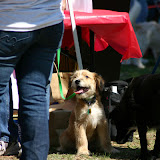
Plus, Annie missed the pictures of the dogs and other animals in the old header, and if your wife isn't happy, YOU'RE not happy. So now I'm happy. Happier. Getting towards the happy end of the scale ...
Oh who am I kidding, I'll probably change some more stuff tomorrow. Sigh.
Quick American Idol prediction (TiVo-ing it, haven't started watching yet):
Your bottom three will be Chris Sligh, Haley, and the other Chris (the one who doesn't move his neck and sings like Justin Timberlake). Going home? Chris Sligh!
Wednesday, March 28, 2007
METAPOST: More Tweaking
Subscribe to:
Post Comments (Atom)


6 comments:
I like it better :) More Bubba Geek than ultra JRRT geek. To be honest I thought for a second the page had been hijacked again when I first saw the shire.
Does the site code permit you to link the images in the header? It'd be nice to click on them to go to a bigger (full) view and maybe even a linked blog entry if it exists. Just a thought. And of course you can always change them from time to time. A kind of favorites gallery.
Thanks, glad you like it better! That's an interesting idea on linking the images in the header to posts, I hadn't thought of that. I'll have to try and figure out how to do that.
I like the new look.
I think version 2 was better than version 1, and this is better than version 2. The picture of the ranchito seems more fitting than the shire. Then again, my opinions matter litte, as I am not Annie.
Then again, my opinions matter litte, as I am not Annie.
Welcome to my world, Jimmy.
Kidding honey, kidding!!
OK, latest changes are to add an image to the beginning of post title links and to make the big image in the header a clickable map, where each of the pictures at the bottom and the big "Field Guide to a Bubba Geek" at the right all link to specific pages. That was a good idea.
I think I'm mostly done tweaking, for now, except maybe dinking with the post title look a bit.
I was right there with Annie...I missed the alternating geek-designer-heroes/bubba-photographer-scenes banner across the top. It's like they say about the great women behind the men.
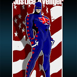
Also thought adding the Bubba Geek diagram on the side was brilliant. I'd forgotten about that character & totally loved him the first time.
Good work BG!
Post a Comment